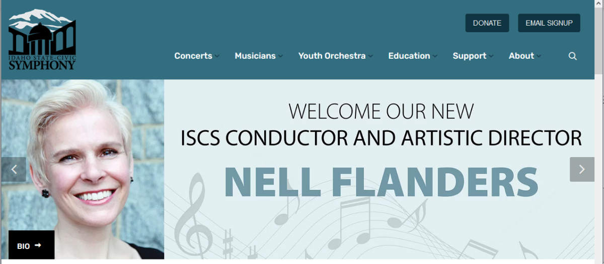
To Do’s For A Successful Nonprofit Website
As our work with nonprofit organizations increases, we are frequently sharing information on the same key elements. In this article we will review four of these leading principles; responsive design, user-friendly navigation, colors, and high quality photography.
Part 1 Design Essentials
Responsive Design
Responsive design refers to your site’s ability adjust to fit any screen size, whether the site is being viewed on a desktop, laptop, tablet or smart phone. Responsive design is one of the highest priorities for any website today. The importance of mobile search means that your site must be available in an easily accessible, size appropriate form on mobile devices, and tablets.
If the site isn’t responsive, mobile users will have a hard time viewing and navigating, which can result in Google lowering your ranking in search engines.
Google’s recent updates (search algorithm) indicate ?mobile friendly? prioritization
Intuitive, User-Friendly Navigation
Well-thought-out navigation is crucial. It is imperative that visitors can find what they are seeking. Some of the more common to do’s in navigation is to use familiar, logical names and avoiding long drop down menus. (No more than 7 items).
One reason the role of thought out and simple navigation is so fundamental is to allow for easy monetization on your site. When clients visit your site their primary goal is to take action, so the menu items that monetize your site, such as shows, tickets, and donate should come first.
Call-to-Action Buttons
Call-to-action buttons are an important component of your website’s navigation. The purpose of a call-to-action button is to encourage visitors to click to do something (donate, become a member, buy a ticket, make an appointment, subscribe to your blog).
Call-to-action button best practices:
- Use action-oriented language, such as Donate, Register, Buy Ticket, Download,
- Sign Up
- Keep text short – 2 to 3 words max.
- Choose a contrasting but complimentary color for your button. It should stand out, but not deter from the web design.
- The most important call to action buttons re-emphasize the monetization path, and are placed visibly above the menu or above the fold in the side bar. If you have more than one call-to-action, create a hierarchy.
Colors
Please remember that you are building the site for your customers based on your branding, and not simply for your enjoyment 🙂
Make sure you select the colors for your site based on sound design and branding principles.
Color best practices:
- Select one or two colors from your brand that are appealing
- With the help of your designer, select the appropriate color scheme for your site.
High-quality photography
We are all susceptible to visual communication, and the right imagery can have a powerful impact on our behavior. By using high quality photography on your website, you can grab people’s interest and connect your cause/vision/mission with theirs. If you have a show make sure your ?Hero image? (top image above the fold) communicates the eminence of the show
Photography best practices:
- Use real photos as much as possible (minimize or eliminate the use of stock photography models)
- If you don’t have the budget for custom photography and you must use stock photography, stick to images of landscapes, city skylines and objects.
- Experiment with filters and overlays to create different looks and moods.
- Avoid pixelated or blurry images at all cost.
- Always obey the licensing/copyright rules!
According to Techopedia, Deep linking is the process of pointing a visitor to a specific page in a website through the use of that page?s link instead of that homepage.? We all know that it is imperative to make sure your patrons get to the point of ticketing for their specific date and time on the first try. It allows visitors to get the information that they are seeking quickly rather than a list of options that might be distracting.
Deep linking minimizes the click to purchase to increase online sales, helps raise more funds and simplifies the subscription process. For example, if a visitor wants to buy a ticket for a particular show and they search for the title of the show in your area online, they will find a direct link to buy tickets for that specific show instead of clicking on a link to your main page and having to do multiple clicks to find the checkout page. (I?ve heard estimates that you lose 18% of your traffic per click ? that certainly matches our experience)
So, some informal ticketing deep link rules are:
Always link them to a specific event purchase page
When sending email blasts or social media, make sure you link them to a specific appropriate page on your web site (not ticketing site) and then send them to the ticketing deep link.
Include direct links in your email signature regarding any shows you are currently promoting (rather than a link to your main homepage).
As LaMae always says – We are happy that folks get to the web site — they can land on any page they like or find. Then, it’s our job to quickly get them to where they need to be.
Related Posts
- ARTdynamix® (79)
- Artificial General Intelligence (31)
- Clients (48)
- Design (14)
- DWG (63)
- LaMae (12)
- Marketing (64)
- Nami (71)
- Search Everywhere Optimization (77)
- Technology (77)
- Updates (87)


